Tried it again, I liked a lot of the improvements you made.
I do, however, have an issue with the color grading. The style is nice, but it's way too washed over the entire screen giving pretty much everything a yellow tint to it. This results in that there's not much contract between dark areas and light hitting those areas.
Hope you don't mind, but I took the liberty to do a quick and dirty color grading to illustrate what I mean.
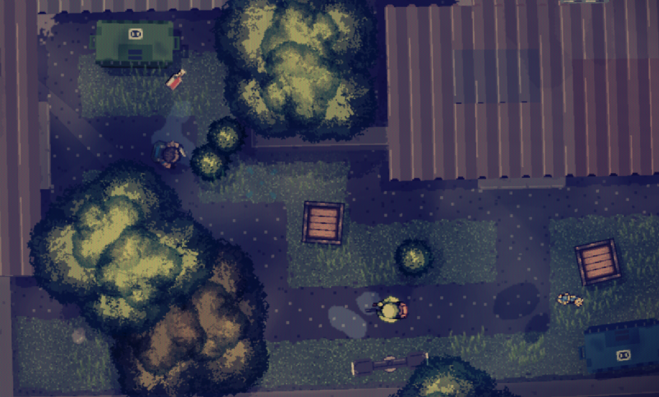
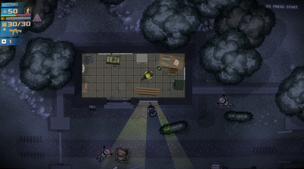
Here's how it looks currenty:

As you can see, the light is barely visible.
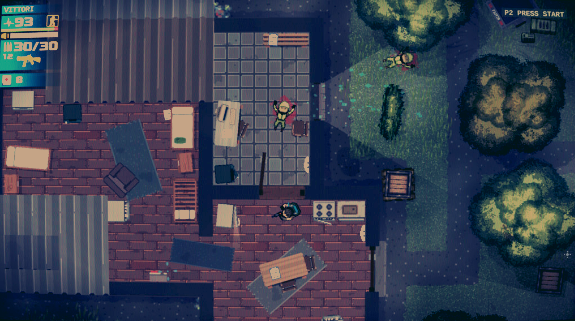
Here's how you can separate things more using color values:


Now you more get a sense it takes place more during night time, perhaps the dark areas lit by the moonlight. And the lights placed and from the buildings become clear. This could also be use to strenghten the gameplay, making the player harder to spot by the enemies in the dark for example.
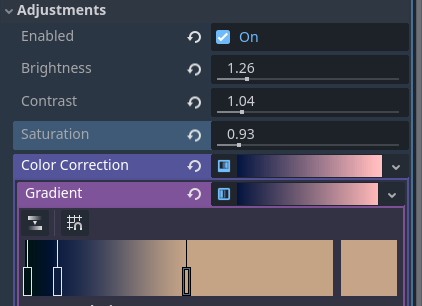
So basically, what I did was,
Dark areas: desaturate, make it a little bit darker, and give it a blueish tint.
Lit areas: Make it a little bit brighter, saturate it a bit more, and give it a slight yellow tint.
This gives both contrast in color and brightness value, making the illustrated environment clear to the player.
This way, you have a good base to color grade further if you want to use an overall color scheme to give it a unique look, but making the contrast stick better.
 The usual approach is to push the lights towards yellow and darks towards blue. But it really depends on your art direction.



 ️
️