- Edited
I'm working on a mobile game and I have some very specific scaling concepts in mind, but I've literally been fighting with anchors and window scaling settings for months now. I currently have the stretch settings set as canvas_items and expand.
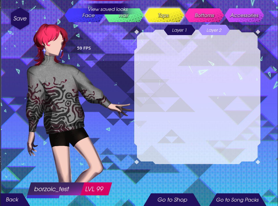
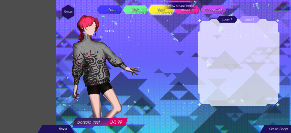
The first image shows the game in a tablet resolution or roughly 4:3, and I have the scene root control node anchored to the full rect of the viewport. So why does everything run off to the right when I scale the window down on the y-axis (to simulate a mobile phone's screen size) in the second image? I just want it to encompass the whole screen while maintaining individual canvas items' aspect ratios and not have any of the gray default background showing.
Also what's up with all the text objects becoming super blurry when scaled down like this?
Tablet:

"Phone":

