SuperDoomKing
To add to my previous post:
I have always wanted to see how far I can push the boundaries of visual design.
Everyone talks about rules, what is objectively beautiful and what isn't.
For me, I know I will never compete on the contemporary level,
with high level of colour theory and shading principals.
So instead I always looked for different ways to make my work stand out.
Something that always fascinated me,
is the use of repeating and weird patterns on an artwork.
In comics with dots and lines,
to represent different colours and shading,
or in old computer images the use of dithering,
surfing the same purpose.
And then there is magazine and poster art and collages,
where anything goes...
And I thought to myself:
"Why not embrace it?"
Instead of making a more conventional anime pictures,
I like maximizing details, just because I can.
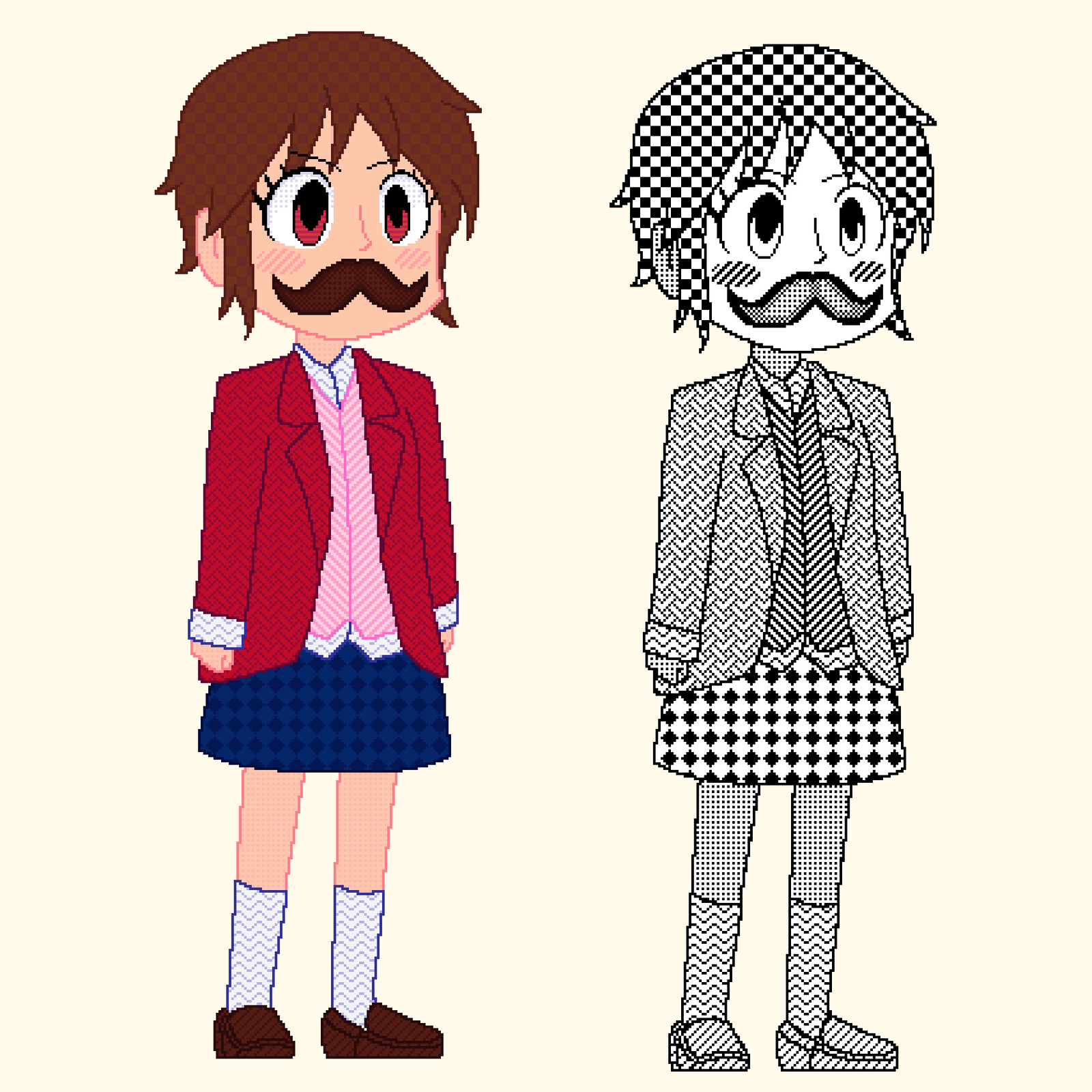
With this picture below,
you see the usage of big checkerboard pattern on the hair,
waves on shirt, diagonal stripes on the vest, weird texture on the jacket,
and some minor dithering here and there.
This piece was more of a hypothetical.
"What would maximum patterns look like?"
And something I could only do in high resolutions.
And for years this piece sat in my harddrive as a bit of a thought.
That was until the newest piece (previous post),
where my goal was to take old ideas for this specific character,
to make something that feels both new and true to form.
The patterns and clothing style was directly taken.
But of course, instead of this chibi esque character,
I made it more realistically proportioned and some colour changes.
I find most interesting: the vest.
In most versions I made of the character,
I often omitted the vest,
but since this was supposed to be the ultimate version,
I made sure to at least suggest at there being one,
same pattern and same colours.
Last thing to note is the eyes.
When I can, I like to make eyes more than just circles.
Like the kiwi fruit motive in Kiwi.
For this character,
I always liked the idea of digital scanline eyes.
So that too was one of the things I felt the need to include.
In terms of other features,
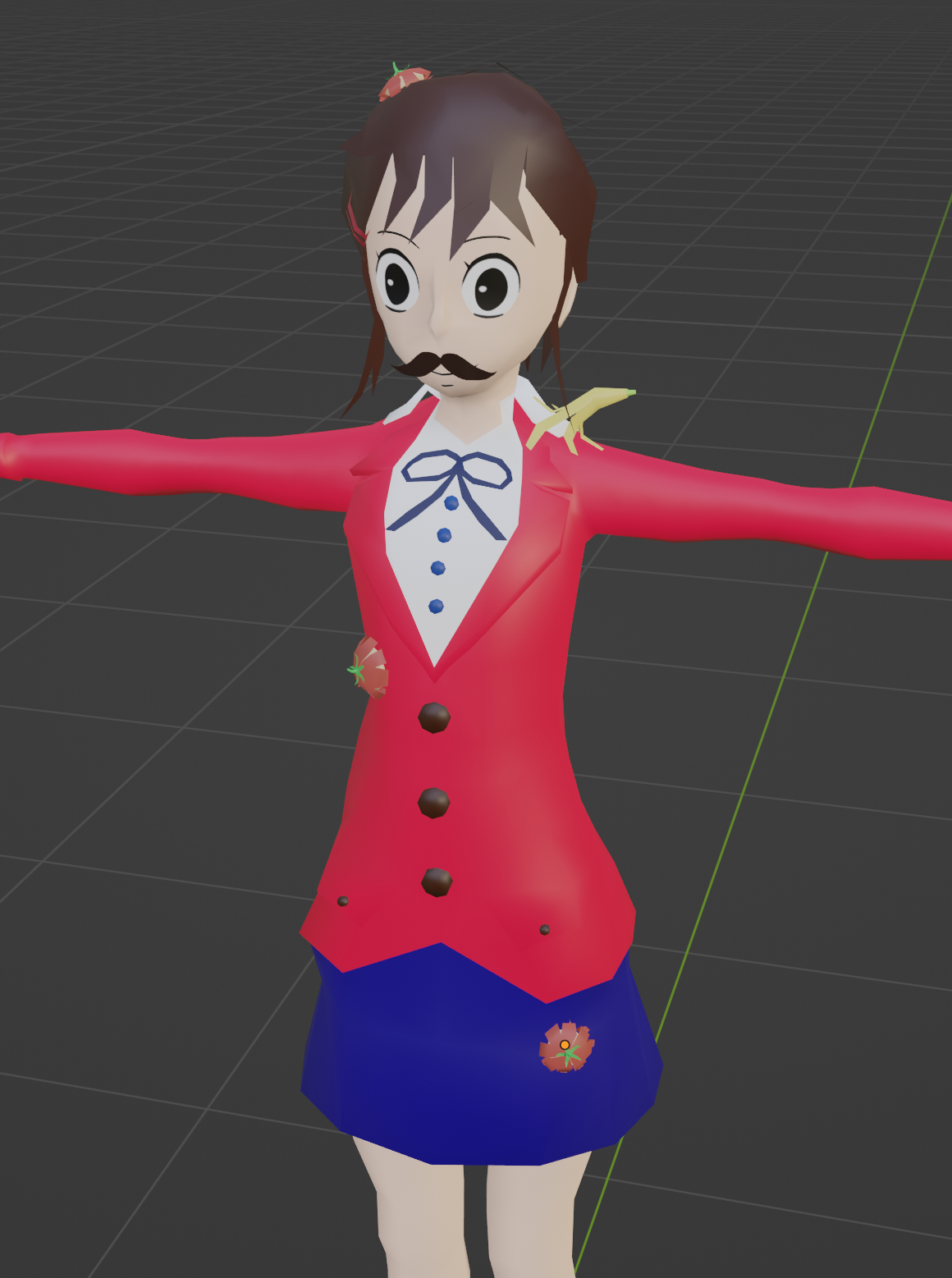
mainly the blue tie and black buttons,
those have been a bit inconsistent in my various versions.
The buttons, blue tie and pockets
I got mainly from this 3D model version.
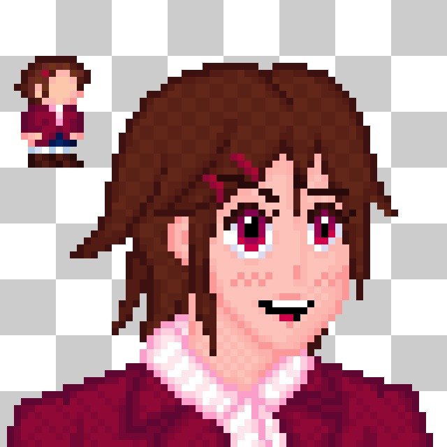
The general pose and colour palette was taken from this smaller 64x64 portrait.
It's almost like a 1 to 1 upscale.
It's got it all: checkerboard hair, magenta hairclip, the exact same eyes pretty much,.
Only notable difference is the pink shirt, instead of the blue one in the final.
But that's because I took the blue wavy shirt from the other image.
While I have a lot more to say about this character
in terms of design and iterations.
I hope this gives you a better idea of why she looks like that.
My technique has both changed a lot, but also not really.
It's hard to find your own niche in the greater art world,
but I hope some will find my work awesome, if not inspirational.
And in case you wonder about the moustache:
I just like whimsy.
My YT Channel


