No more 'childish' or 'unprofessional' as these imo:

I don't personally see there being any reason to change it, it's not offensive and entirely optional in your exports anyway.

I will say I have no idea what the logo is supposed to represent. Unreal being a giant U makes sense from a brand perspective. Unity being a mishmash of a default cube and the XYZ gizmo makes sense also as both are related to gamedev.

Godot's logo is...? I think some kind of internal reference only the original devs know? Obviously it's a robot's head, but WHY is it a robot's head? Would be good if the logo had a docs page that explains the history and maybe what previous logos if any were?

@duane said:

You could apply some variant of all of her points to free software in general. I hope no one takes them seriously, but I know people do -- the first post I ever made here was about how much I enjoyed the godette logo. Someone had to immediately jump in and label it a sexist joke. /shrug

Wow. It was just an April Fool's joke for crying out loud. No one should have even seriously entertained the concerns of the trolls with any type of response.

To my mind, I think most people expected something more minimalistic when it came to game engine logos. Since the Godot Engine is for everyone(kids and adults alike), I think it could benefit from more of a neutral type of look. Also, the controversies surrounding the Godot engine( regarding bikini Godotte and the April's fools joke) strongly imply that they're people who don't believe that Godot is for everyone; thought I guess that has less to do with the logo. I was never a fan of bikini Godotte but, I didn't know it became "controversial".

@Bimbam said:

Unity being a mishmash of a default cube and the XYZ gizmo makes sense also as both are related to gamedev.

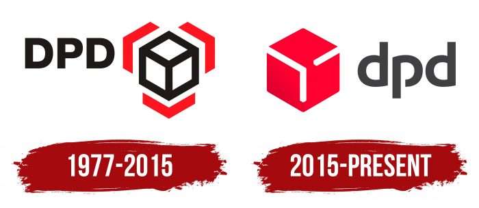
I'm not really sure which came first(or am I?), but Unity logo and a certain EU logistics/package delivery service logos for comparison(I wonder which one of these "plagiarized"[technically since they aren't in the same industry the trademarks don't clash] the other...):

The only controversy I had with it was that godette's not that cute. The triple bun thing she has going on was never my kind of thing.

@Bimbam said:

Godot's logo is...? I think some kind of internal reference only the original devs know? Would be good if the logo had a docs page that explains the history and maybe what previous logos if any were?
It's a robot. duh.

ok in all seriousness I don't see why it needs to represent anything to be professional. It's just a cool little robot.
I mean no one calls blenders logo unprofessional and I don't think anyone even knows what it is.

Edit: I do stuff out of order. after writing this I googled what the blender logo is, and... It's literally a hand doing the "OK' sign with an eye in the center to represent visualization.

So I guess the meaning of the blender logo is, "Okay visualization" lol

I made the perfect logo for my work on godot.

No robot involved!

Actually, if the Godot 4.0 logo was a meme face, I bet they would get 10M downloads as a joke.

@cybereality said: Actually, if the Godot 4.0 logo was a meme face, I bet they would get 10M downloads as a joke.

Dayum! Godette better watch out! XD

Obviously the best one is for the LÖVE engine:

:)

Yeah, the love one is cute. I'm not saying to make some geometric Autodesk rip-off logo. I think the robot is a good idea, just get a good artist and a modern style. I even offered to pay for it, but Juan said no.

@cybereality I hear what you're saying, but I have another idea

The community is vital to Godot. I don't think this platform would survive without the unity if its users. This is why I think it's tragic the way a harmless joke has splintered so many users. The logo is the face of our community and it needs to be a symbol of union. Togetherness. Like the water nymph in the myth of Hermaphroditus, people's love for this engine have been scorned. They want to work with the engine but they are told away by this logo telling them they are children. That they will never be a true professional. And so, as the water nymph became one with Hermaphroditus to create what some may call beautiful, but others an abomination, I present a possible new logo. One that says we all go together. Godegether.

Godot 4.0 will be upon us soon. Let it be 4 the future. (my drawing tablet broke)

@some_lame_kid

Ok, when I saw that picture, I almost dropped my phone, because I thought the godot logo was eating somebody's head. :o

Well, I was joking, but it's a real issue. The fact that the idea of redesigning the logo comes up like every few weeks, only to have long flame war discussions, proves it is polarizing. And the fact that the devs won't even consider the community feedback at all, leads me to think they are not prioritizing the needs of users. I understand that open source is not a democracy, but, also, any successful project is about fulfilling users needs and requests. If the users are not happy, and you are not willing to make them happy, then why bother in the first place? Don't even release the software at all if you don't care about users.

Aren't there aspects of Godot that are much more important than its logo?

Come on, man.

One thing that could use improvement is designing the layout of a UI. I like the way that Android Studio handles that.

@duane said: @some_lame_kid

Ok, when I saw that picture, I almost dropped my phone, because I thought the godot logo was eating somebody's head. :o

@DaveTheCoder said: Aren't there aspects of Godot that are much more important than its logo?

Come on, man.

One thing that could use improvement is designing the layout of a UI. I like the way that Android Studio handles that.

They are doing a great job. GDscript is so much better than it was a few years ago. They've made all kinds of engine improvements. I could care less about the logo, but I think it's just fine the way it is. I can't believe this topic has lasted so long on something so unimportant.