- Edited

We are trying to make some background art for our mobile game. How much can we put in the background without disturbing the gameplay.
We are trying to make some background art for our mobile game. How much can we put in the background without disturbing the gameplay.
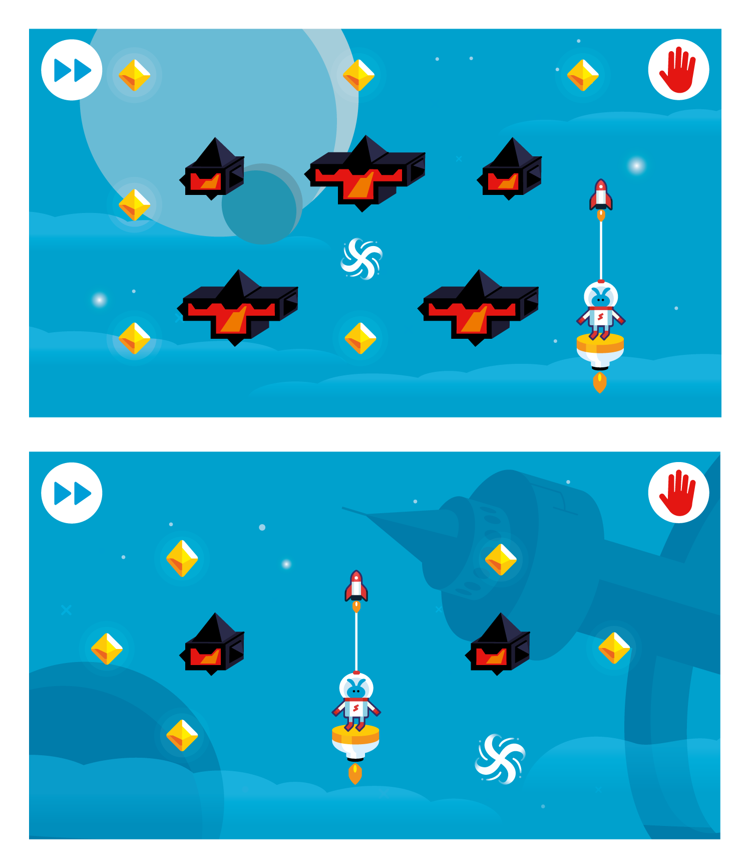
Although I'm a member of the team making this game, I want to share my thoughts here as well. I personally like the backgrounds, but the items that have too much contrast feel like they are a part of the game (puzzle) and could distract the player. Like the dark moon in the first screenshot, and the space station in the second are on the edge for me. Very curious what others think.
I like the style but I agree that the contrast and saturation is too much. The color palette is great, though.
I would recommend either lighting or darkening the whole background. It should be subtle and almost look like one color. That way the interactive objects pop out more.
make the background parallax and pan in a direction. When the player is staying in place everything that moves is the BG. Easy enough for the player then to tell the BG apart from the foreground.
edit: I should say, everything that pans with a constant speed in that one direction is the BG, you can still have some dynamics in foreground too.
Thank's all for the feedback! We have made a few options for the backgrounds based on the feedback. We think the top ones gives the most graphical interesting image. Which one do you like the best?
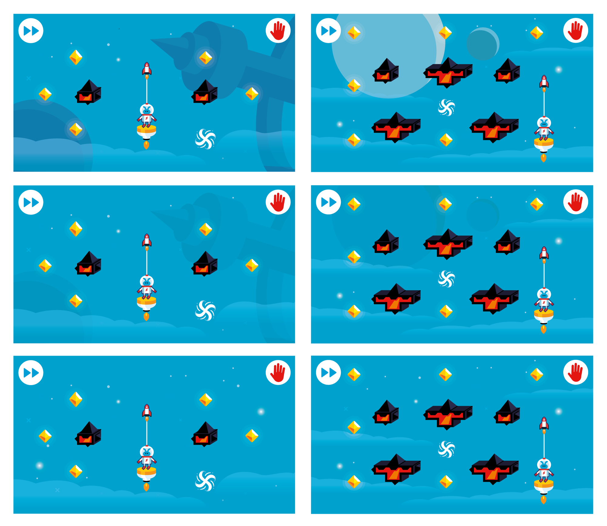
Top
Top. Middle row looks foggy to me.
I can imagine parallax bg/fog - it would look like middle row, but when you fly up atmosphere is cleaner, and you will see it in nice colors (top row) 
Medium. The top one looks good, but in the game the too harsh background can be distracting. Need to see if it gets in the way during the game.
Oh, I first replied to the last post, and then I read the thread (of course I should have done the opposite) and saw that @pvanvliet was saying the same thing.  Anyway, I totally agree with him.
The top row looks best, but it still looks a little in your face, Maybe something inbetween top and middle.
Also, if you have a parallax background that might help, it's hard to see if it would work in static images.
I suppose that to assess the playability it would be good to record a video, or better yet, post a demo level.
Thanks for all the feedback, very much appreciated! Most votes go to the top row, so we've played around with the higher contract elements a bit. It seems to be a matter of finding the right balance. We've recorded a little video of the game with a background we think has this balance. Curious for your thoughts!
Interesting game.  ️ I still suggest that you tone down the harshness of the background.
Cool. I think that looks pretty good.
Thanks again for your replies! We're starting up again for this new year and want to share our progress. We've removed the higher contrast elements from the background and added drifting clouds. You can this effect and some more of the game in the video below.
Curious for your thoughts!
The background is not confusing or distracting from the game. In my opinion, very good. ️